SEARCH
Browse our collection of some of our favorite past events! From Santa Barbara to Del Mar, Palm Springs to Laguna Beach, and everything in between! These posts contain precious memories, incredible vendor work and gorgeous photos!
The Blog
WELCOME TO
blog
Contact
Experience
ABOUT US
HOME
Palm Springs
Design
Central California
Southern California
CATEGORIES
Small Weddings +
Elopements
LOOKBOOK
January 20, 2021
J+E Design | Behind the Scenes
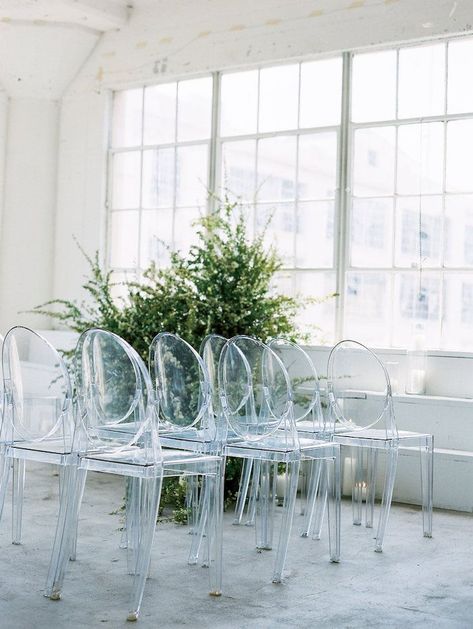
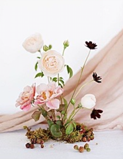
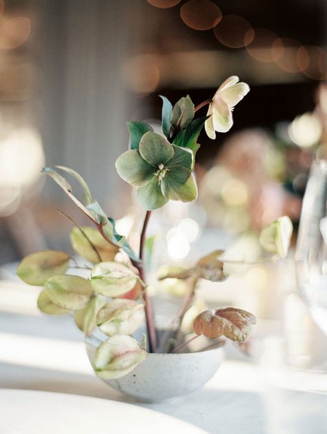
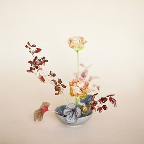
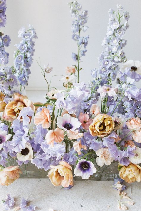
If you read our last blog post, you know that planning Jessica’s wedding was a whirlwind! It felt as though the moment we solidified her venue and design plans, she was forced to cut her guest count down, find a new space to get married, and adapt her design to fit a completely different venue. Below are Jessica’s mood board and color palette. These were designed with her initial venue in mind- a modern, industrial space with ultra high ceilings, white walls, and concrete flooring. Jessica had a vision to combine a super feminine garden style with an artsy, modern aesthetic. We weren’t willing to compromise her design even when it felt like things were turned upside down. Throughout this post, we will dive into the elements of her design we adjusted to fit her new venue, while staying true to her personal style.
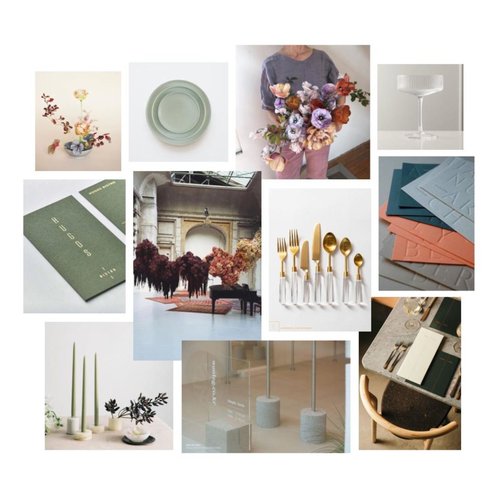
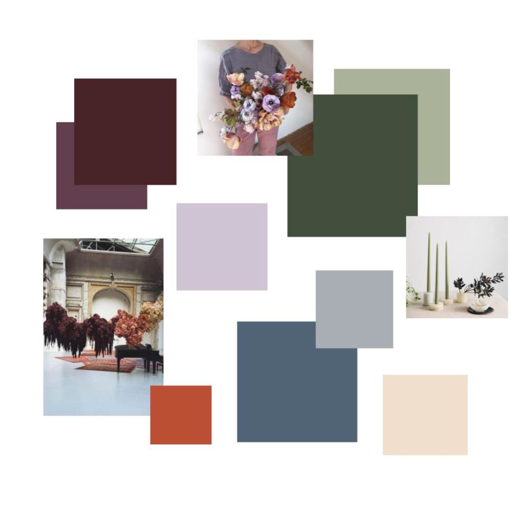
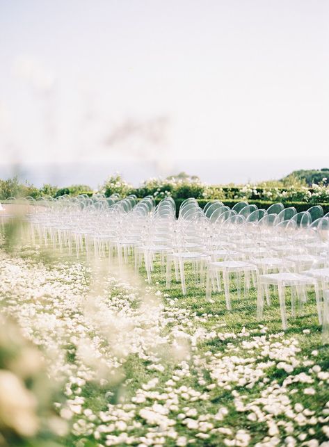
When we switched Jessica’s venue to a family home, one of the spaces we wanted to take advantage of was the beautiful view from the driveway. We decided to set up the ceremony in this spot because of the rolling hills and natural landscaping.
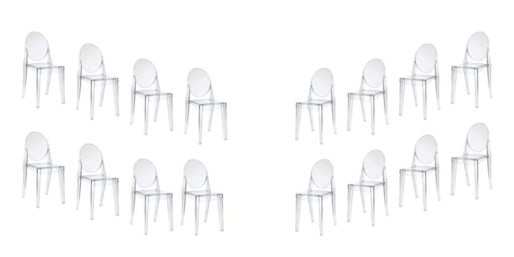
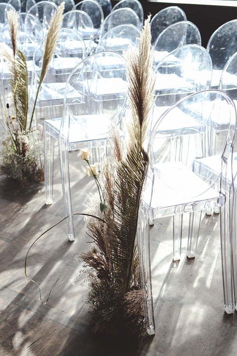
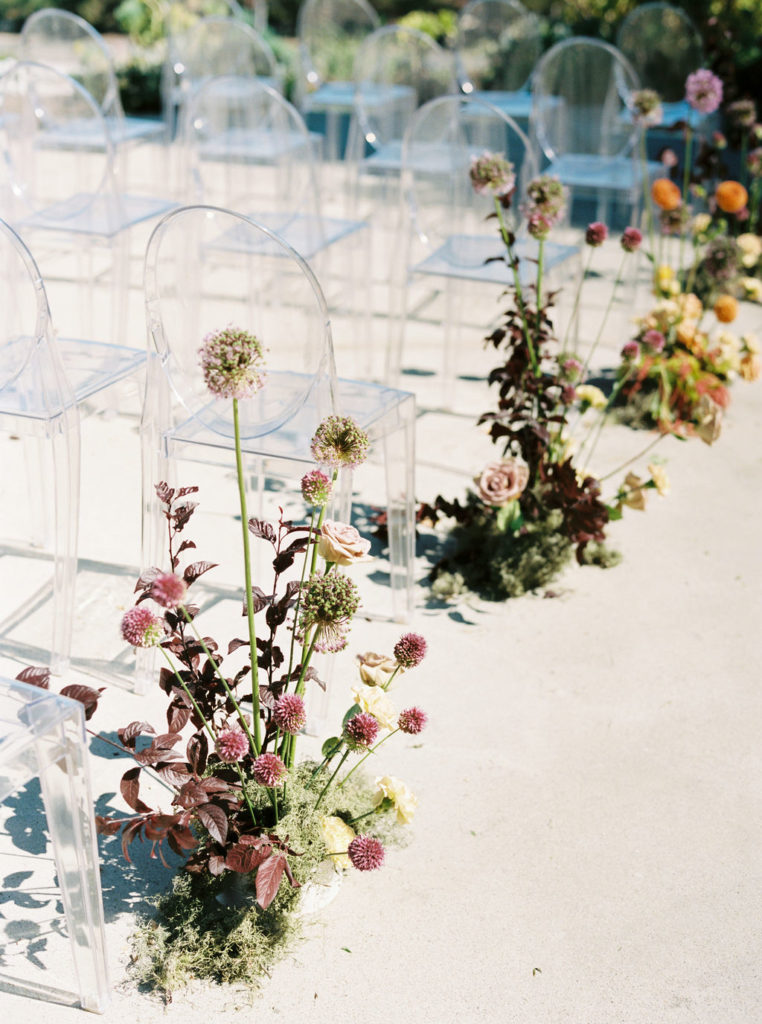
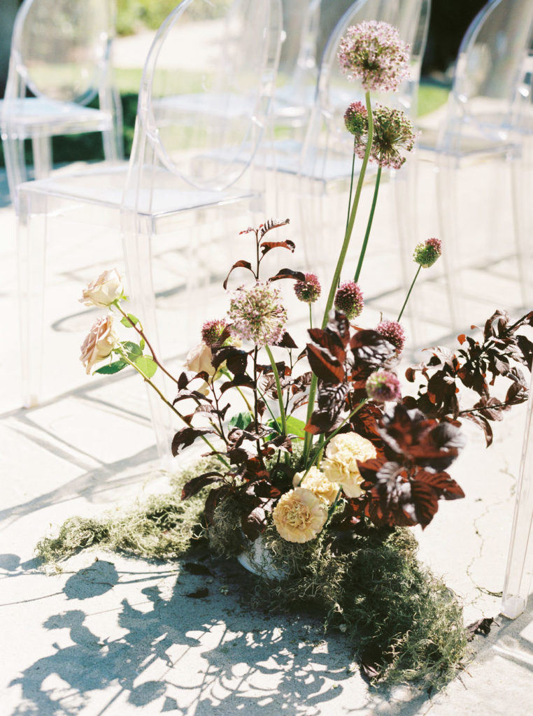
We selected a simple, sleek ghost chair to take up the least amount of visual space.
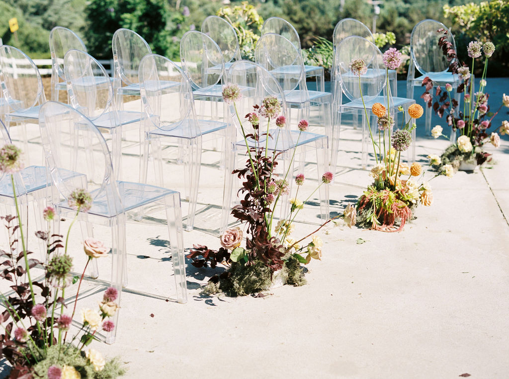
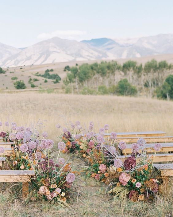
We flanked the chairs with floral arrangements in varying heights and textures to add a pop of color down the aisle without appearing too busy.
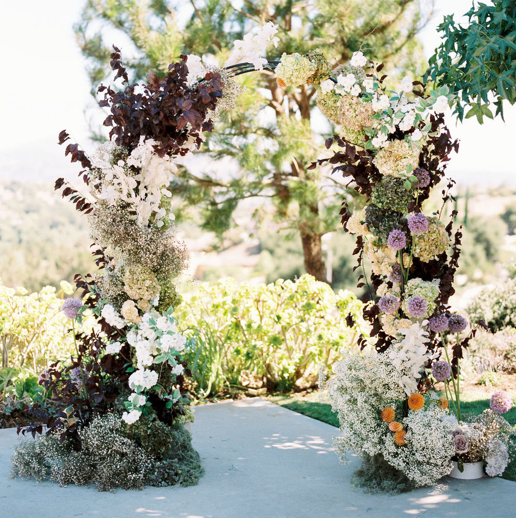
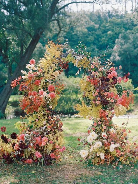
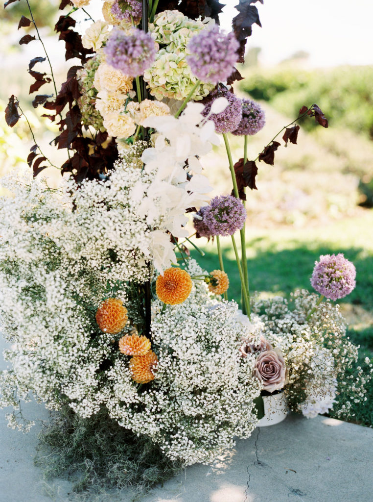
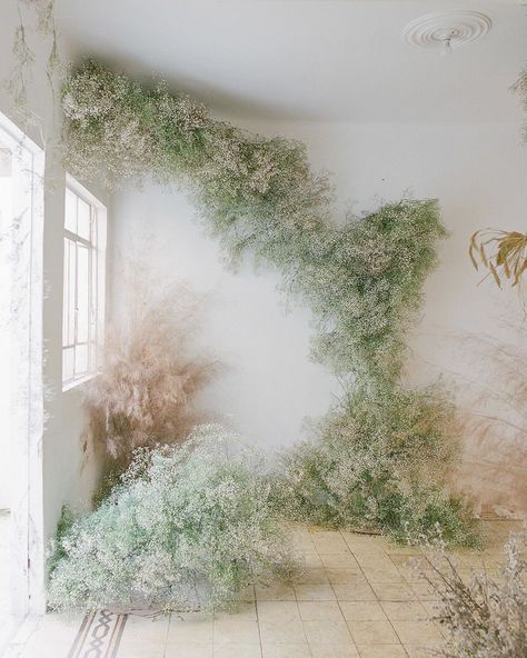
Because of the minimalist aisle, we decided to make a statement with the arbor. Using the image above for inspiration, the crazy-talented duo behind Bloom Babes utilized groupings of different floral varieties. This created a full, lush look while maintaining a simple, modern feel. This is one area we emphasized the darker colors in Jessica’s palette.
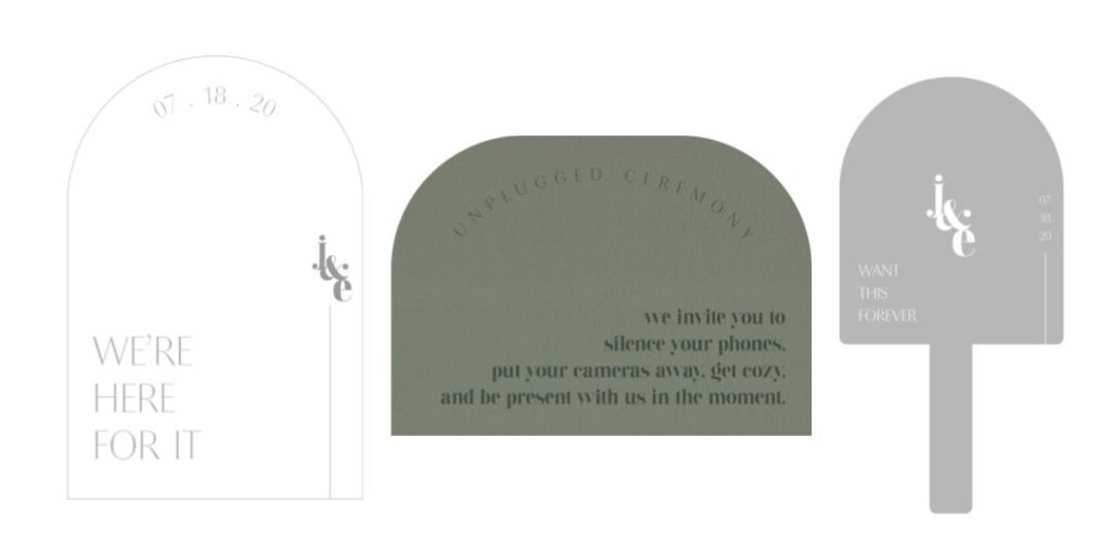
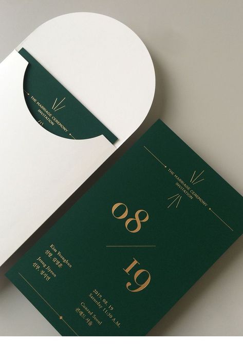
Alyssa, of Fawn Lettering, created a custom logo for Jessica and Erik which we paired with modern fonts and rounded shapes. We strategically designed the layout of her paper goods and signage to create negative space and a unique look.
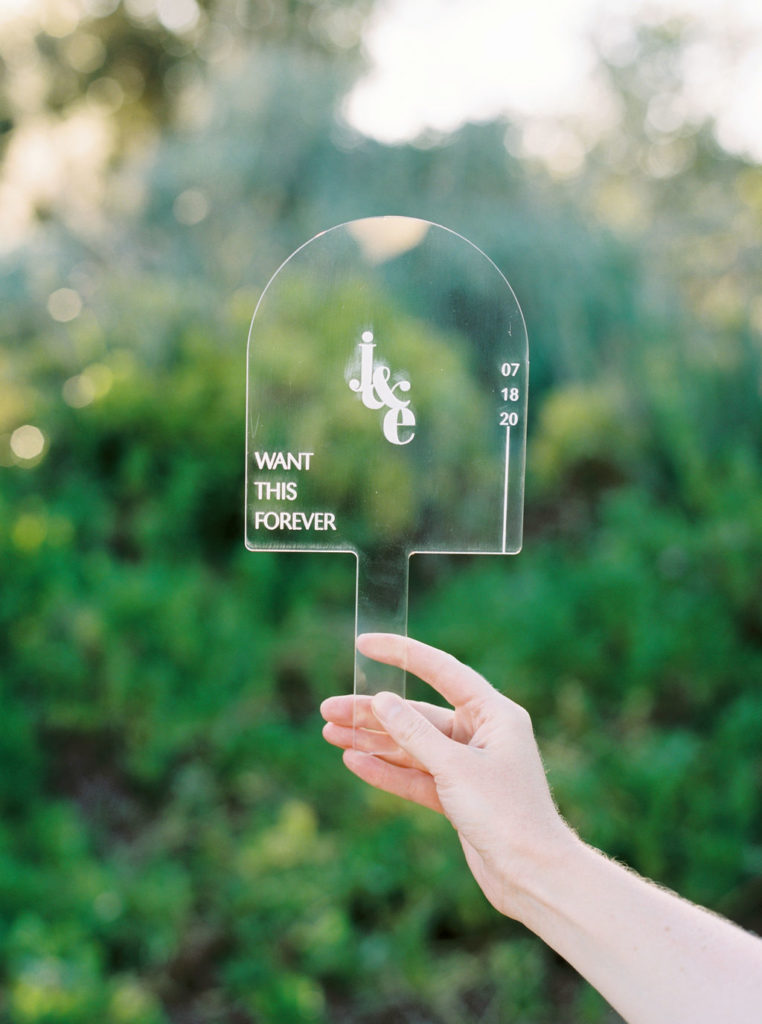
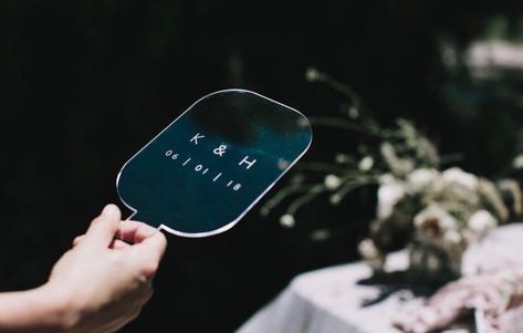
We originally planned to incorporate several acrylic pieces for Jessica’s signage. With the change in events and shorter timeline to retrieve materials, we focused on using specialty mediums in a few areas. One piece Jessica had her heart set on was an acrylic fan.
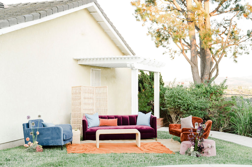
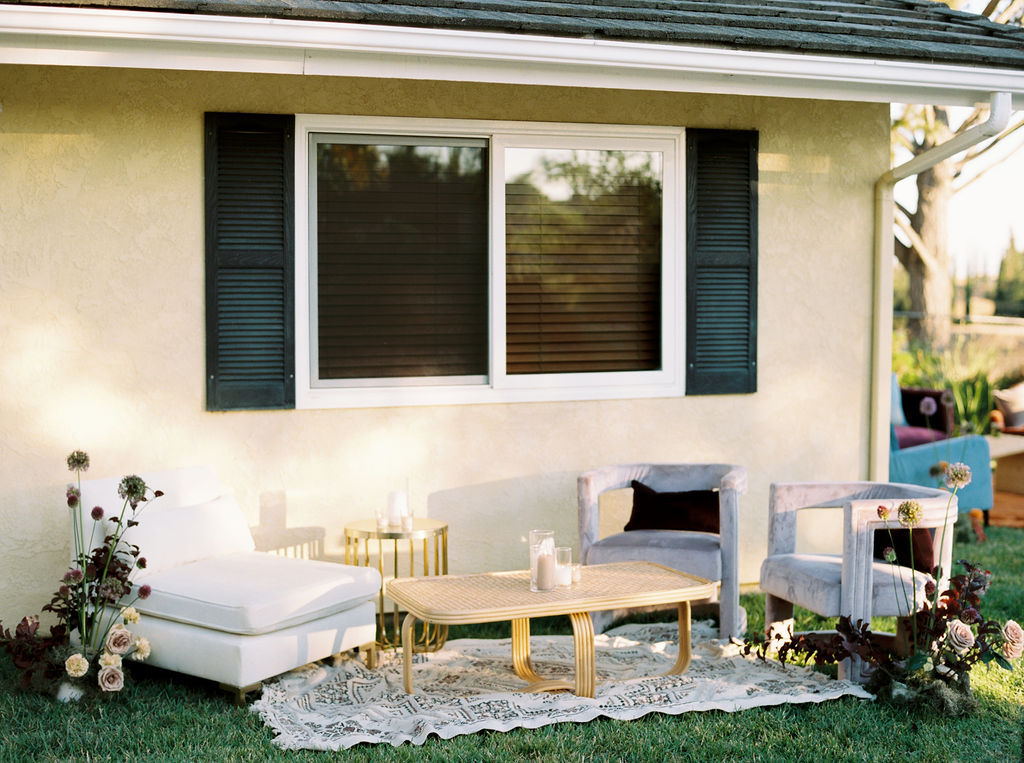
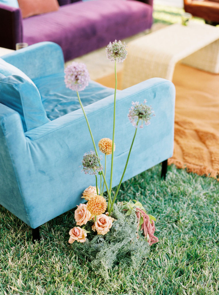
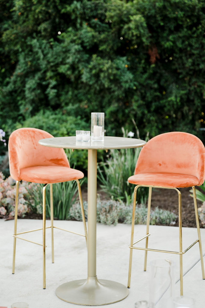
The other area we went full out with the color palette was in lounge furniture! We selected pieces from Folklore Rentals with a modern aesthetic, gold accents, vibrant colors, and mix of textiles.
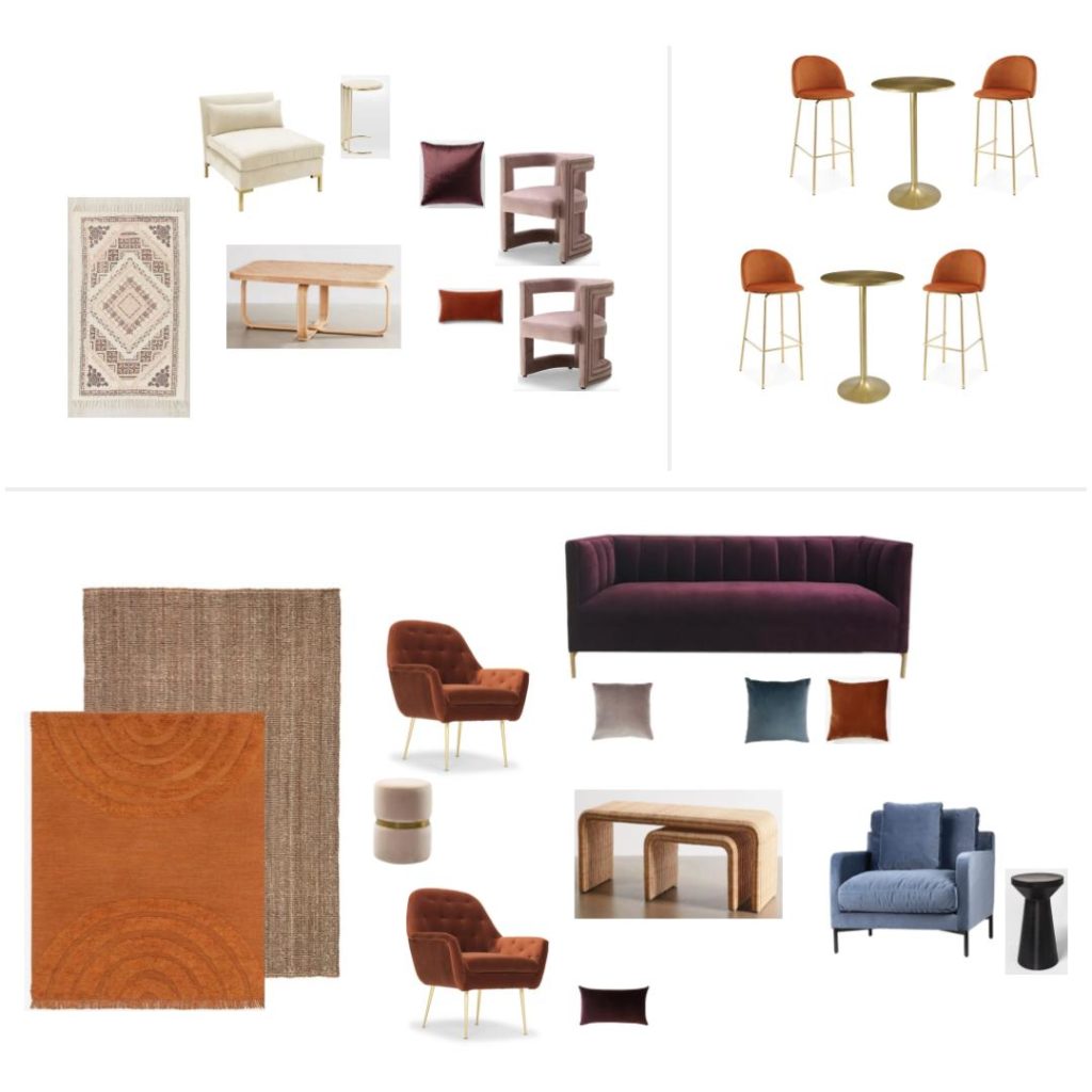
We designed the lounge spaces in the backyard to match Jessica’s personal style. We were fortunate enough to have a fairly neutral exterior and well-kept landscaping that served as a great blank canvas.
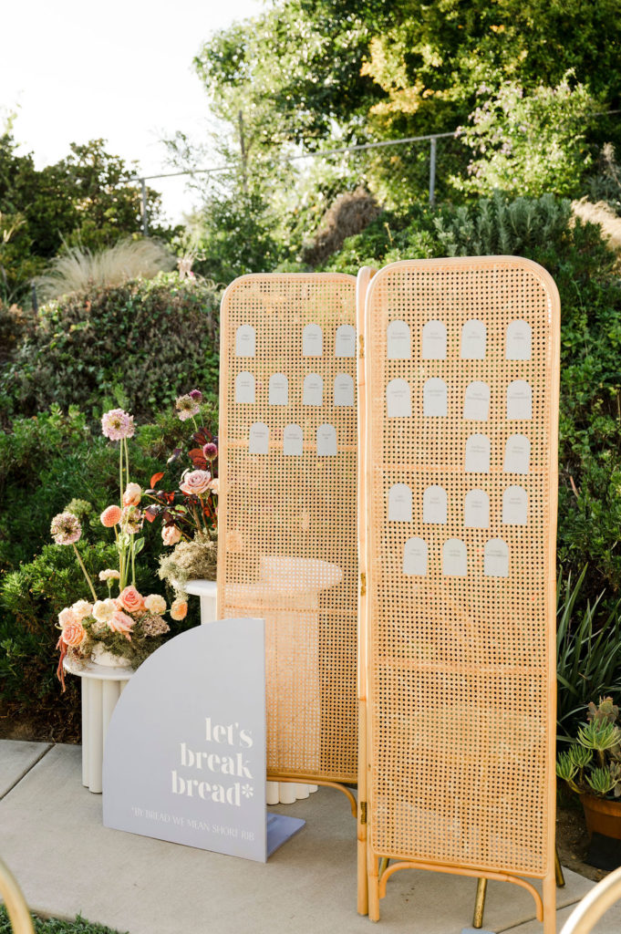
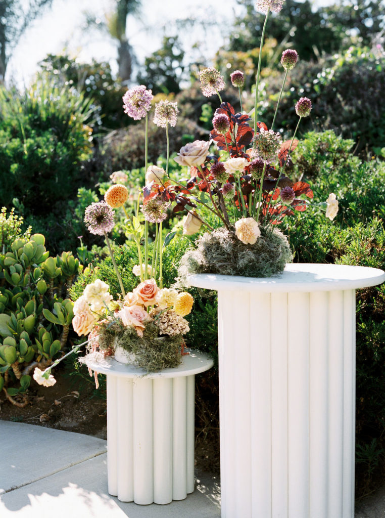
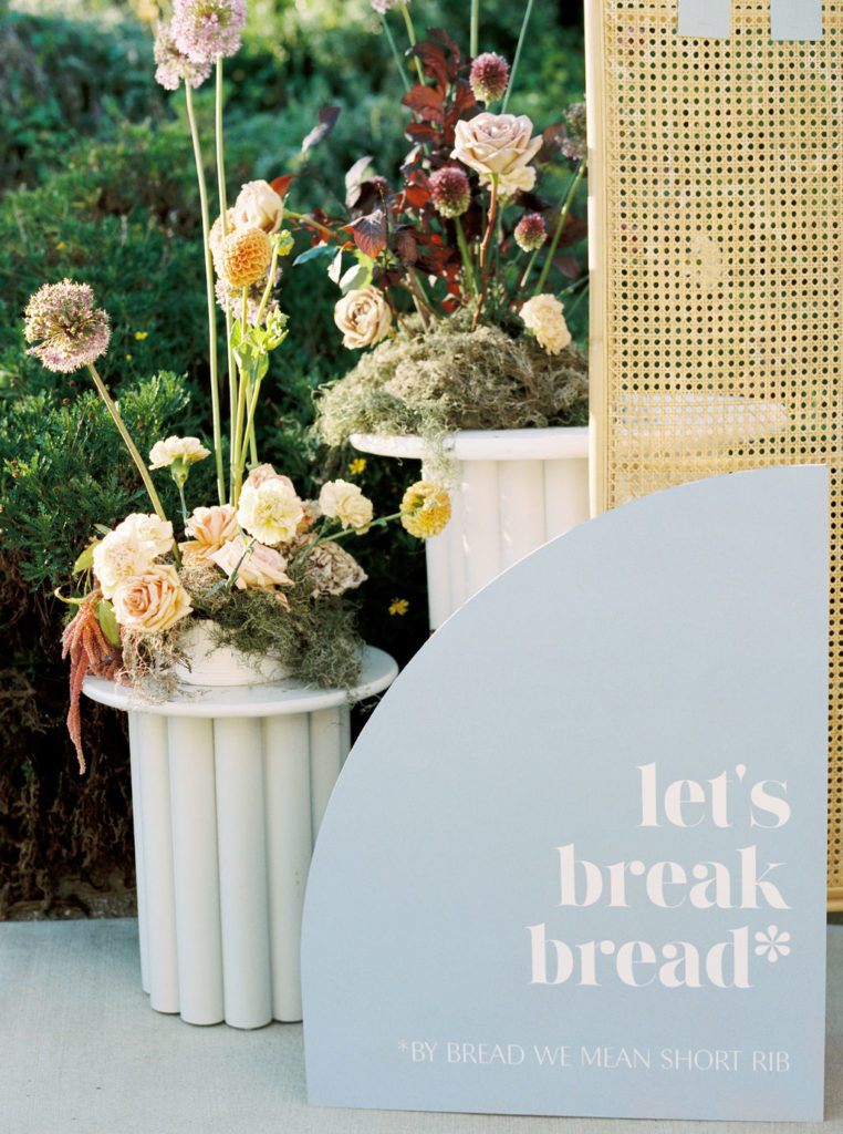
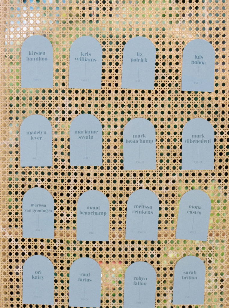
We initially planned for a large, backdrop-style escort display. Of course, this changed when the guest count dropped from 130+ to an intimate backyard gathering. We still wanted the escort display to make a statement, so we built off a couple rental pieces from Folklore and added a custom sign and name tags designed by Fawn Lettering.
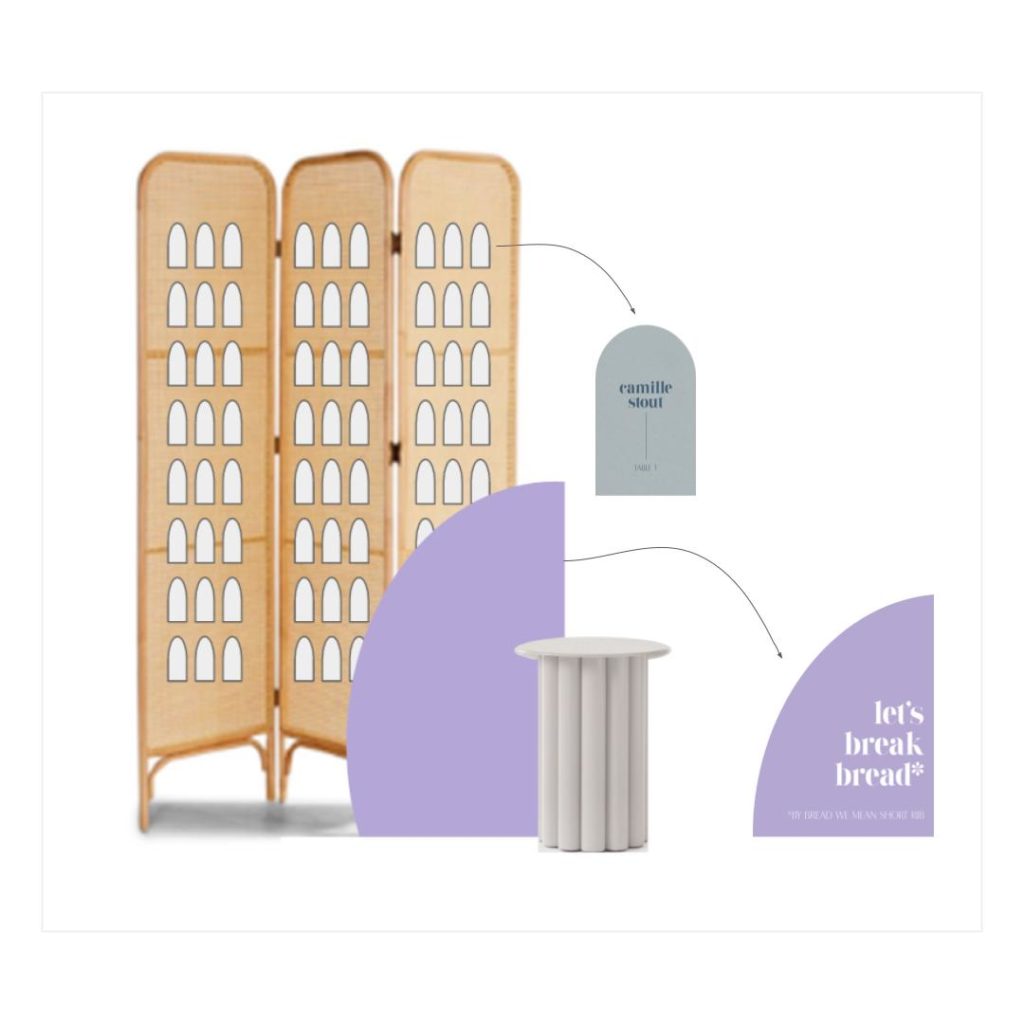
We mixed custom pieces, rental items, and floral accents to make this seating chart feel really special and original!
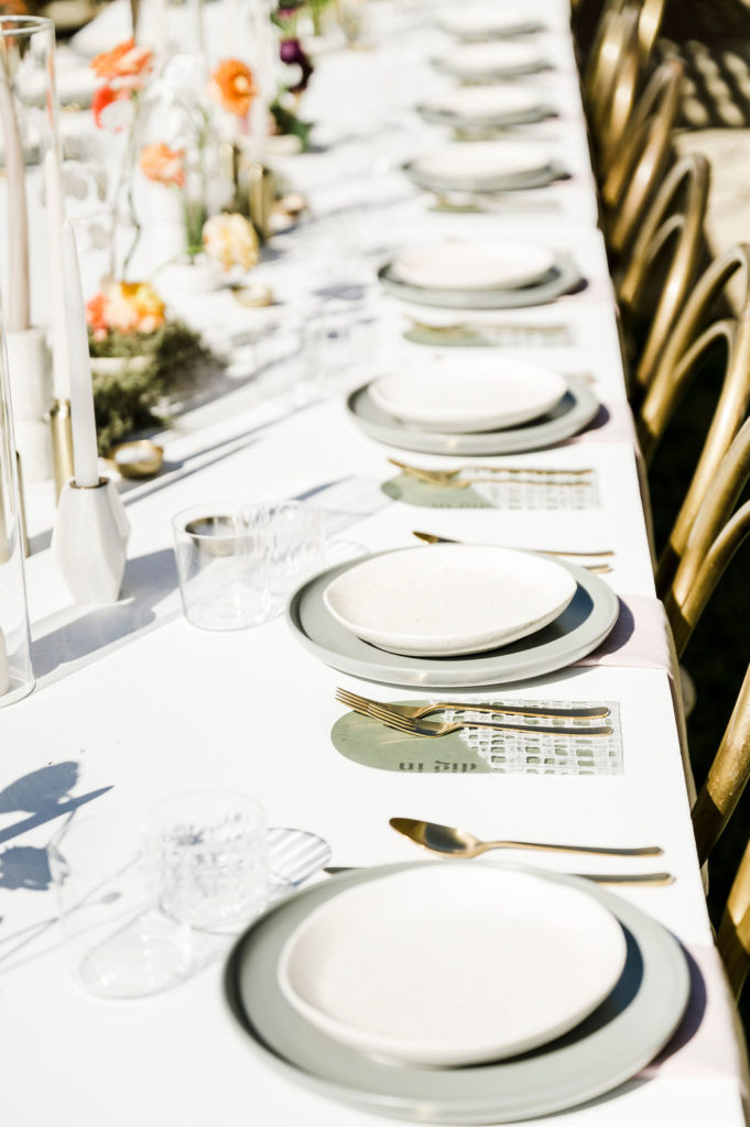
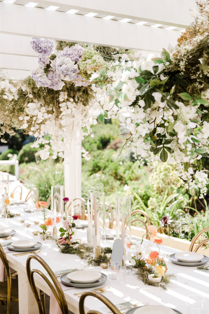
For the reception space, we pulled modern white farm tables and gold bentwood chairs. While the original plan was to use natural wood tables and white chairs, the picks below suited the new environment better.
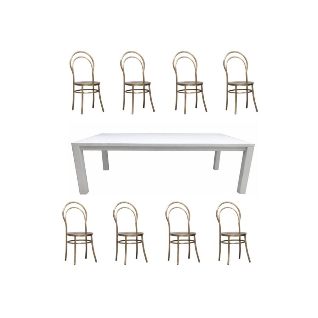
The white farm tables blended in seamlessly with the overhang and served as the perfect base for Jessica’s tabletop items. The brass bentwoods added a much needed feminine accent to an otherwise angular dining space.
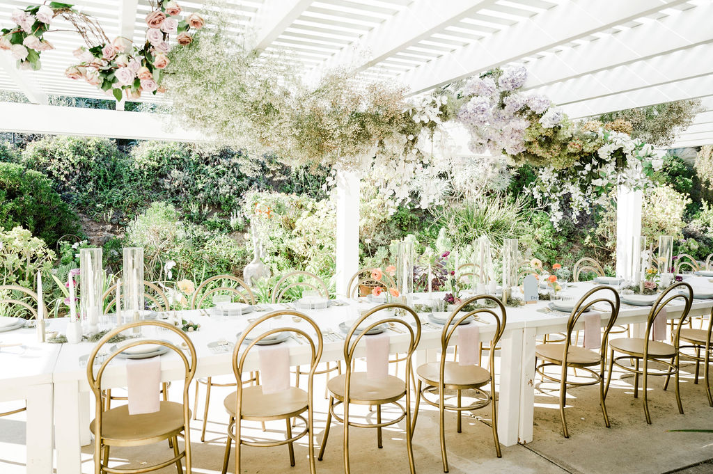
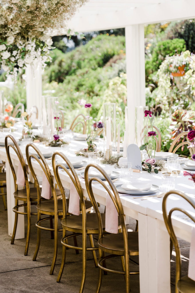
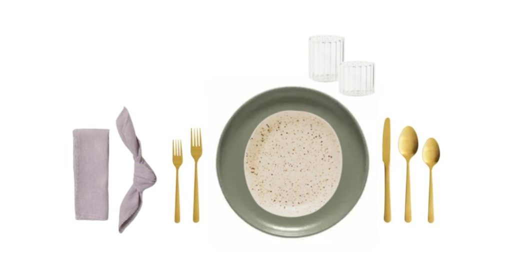
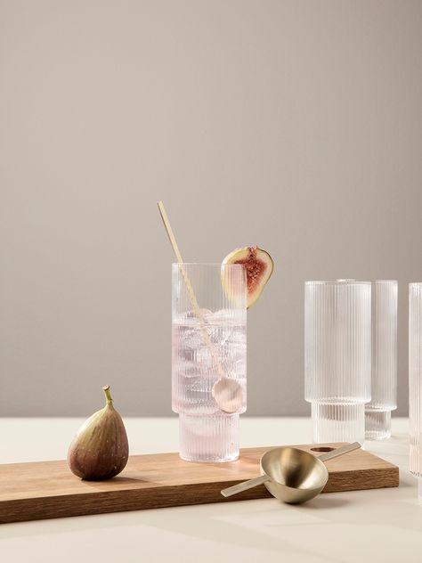
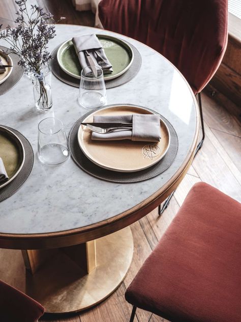
Our tableware inspiration included textured glassware, muted colors, and gold accents to tie in the bentwoods.
Catalog Atelier’s expansive inventory had endless combinations that fit the bill. We landed on a muted sage green plate, topped with a speckled hand-made ceramic dish that added an organic feel to the otherwise modern tablescape. Ribbed glassware imported from Italy, sleek gold flatware, and lilac napkins from Hostess Haven completed the design.
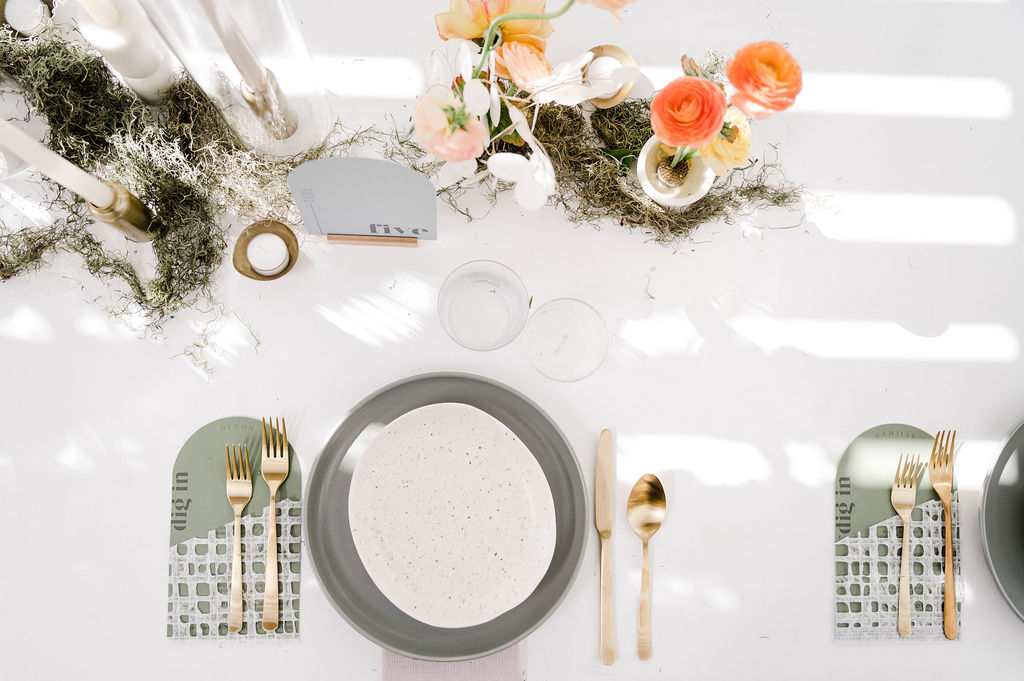
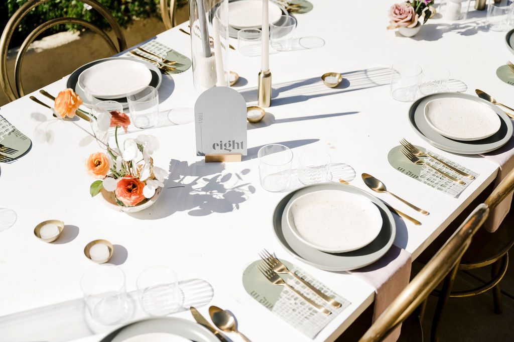
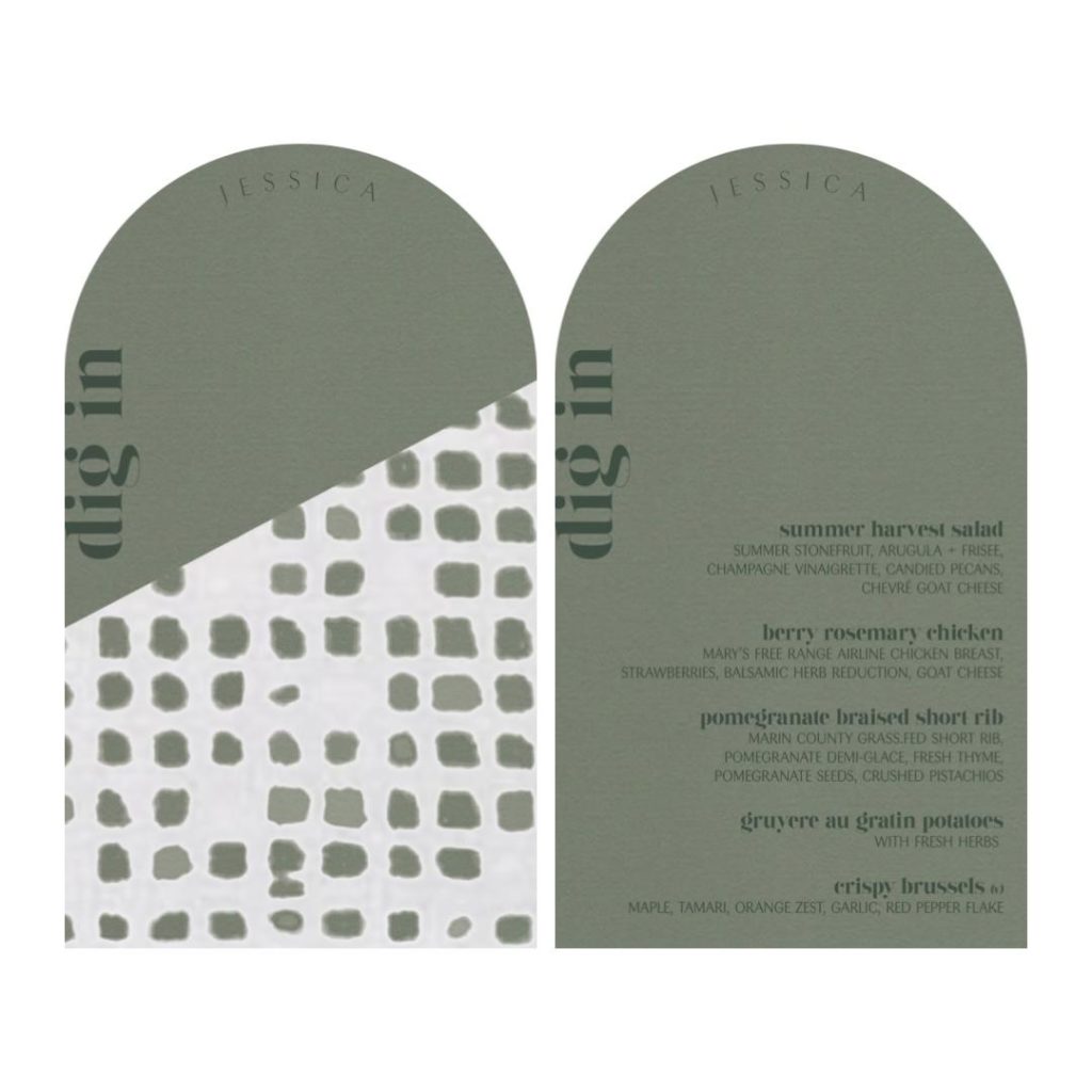
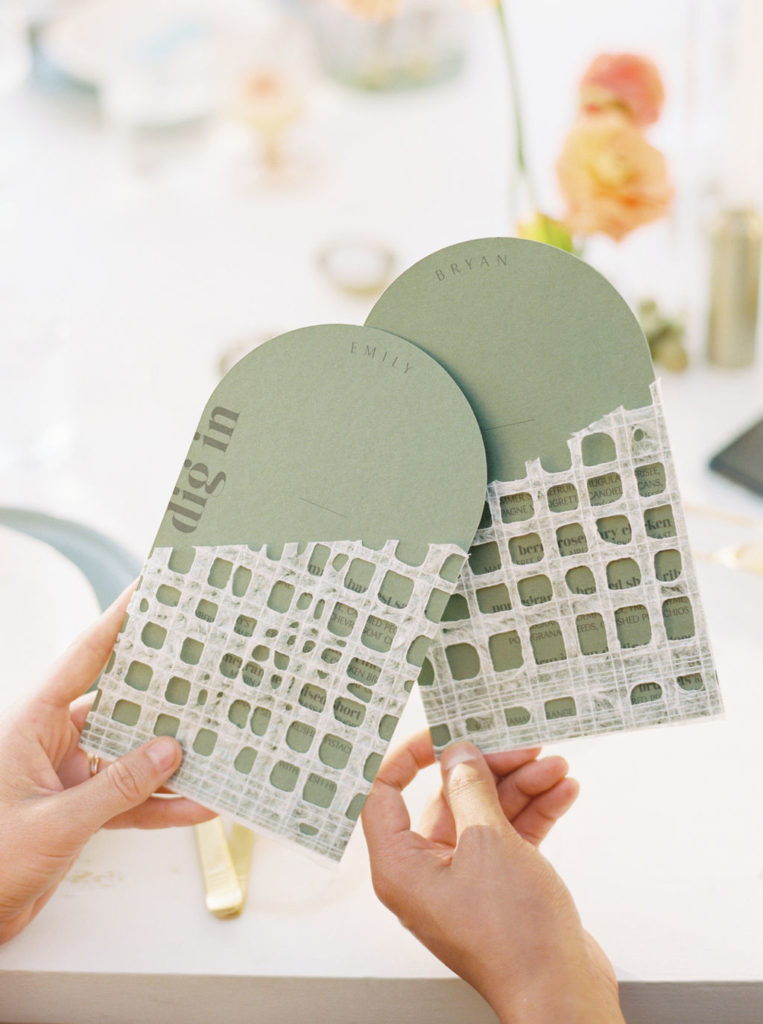
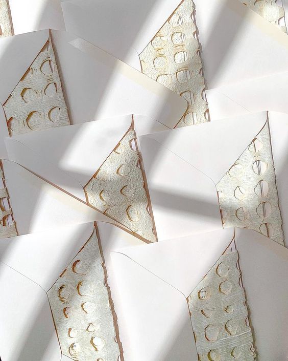
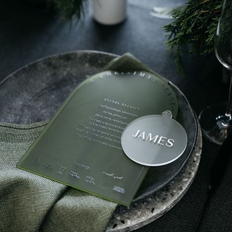
Jessica’s dinner menus were another area of signage where we knew we wanted to make a statement. We carried over the arched shape and modern fonts from her other signage pieces, and added a fun, textural element to make them feel more unique.
Jessica and Fawn Lettering designed a menu that also doubled as a placecard. The textured paper sleeve revealed the menu items and descriptions.
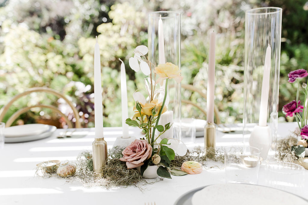
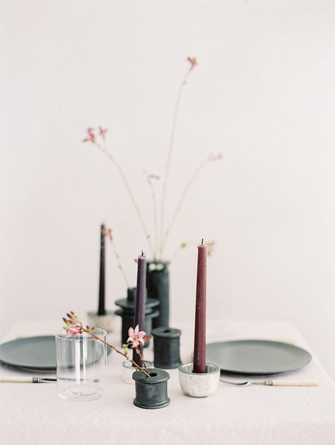
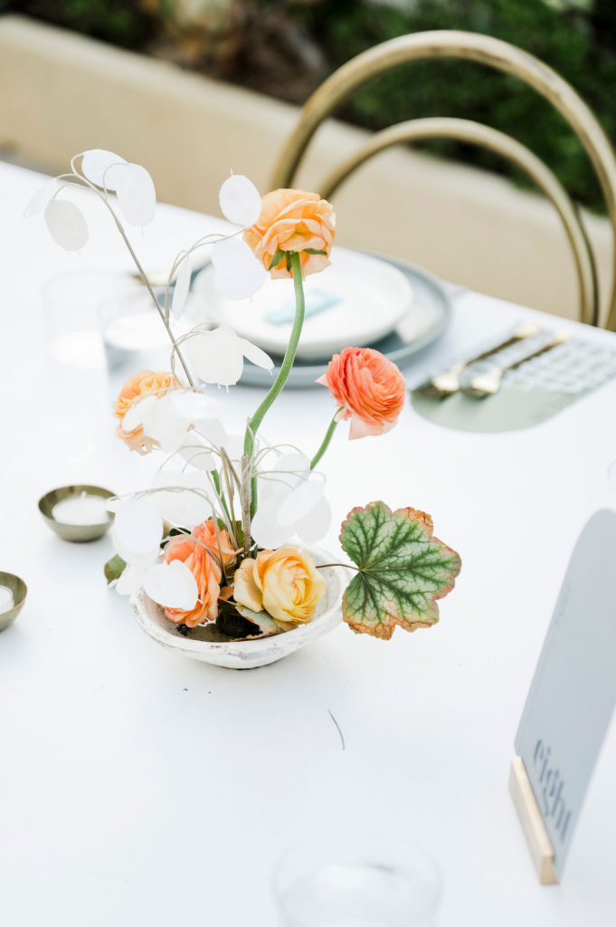
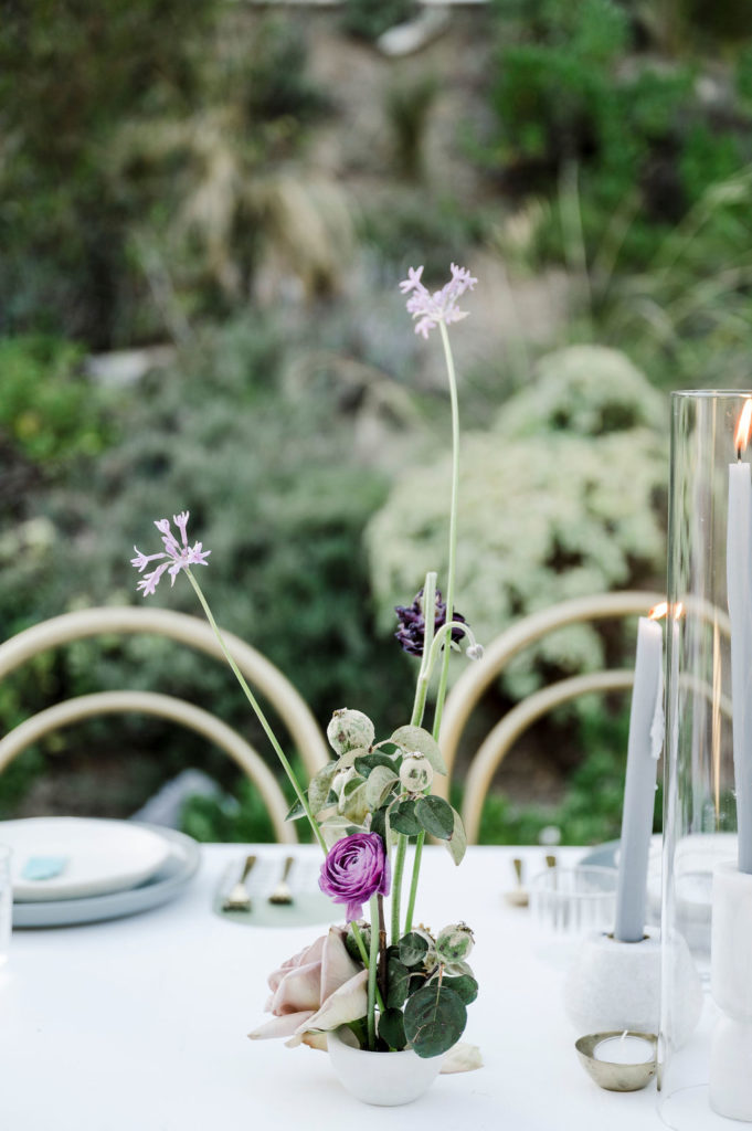
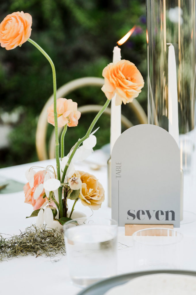
The reception florals were broken down into two main components- an overhead installation and tabletop florals. Dinner was served family style, so we selected a tabletop treatment that created a big visual impact without taking up too much space. Bloom Babes designed satellite arrangements incorporating pops of color, paired with candles in varying heights.
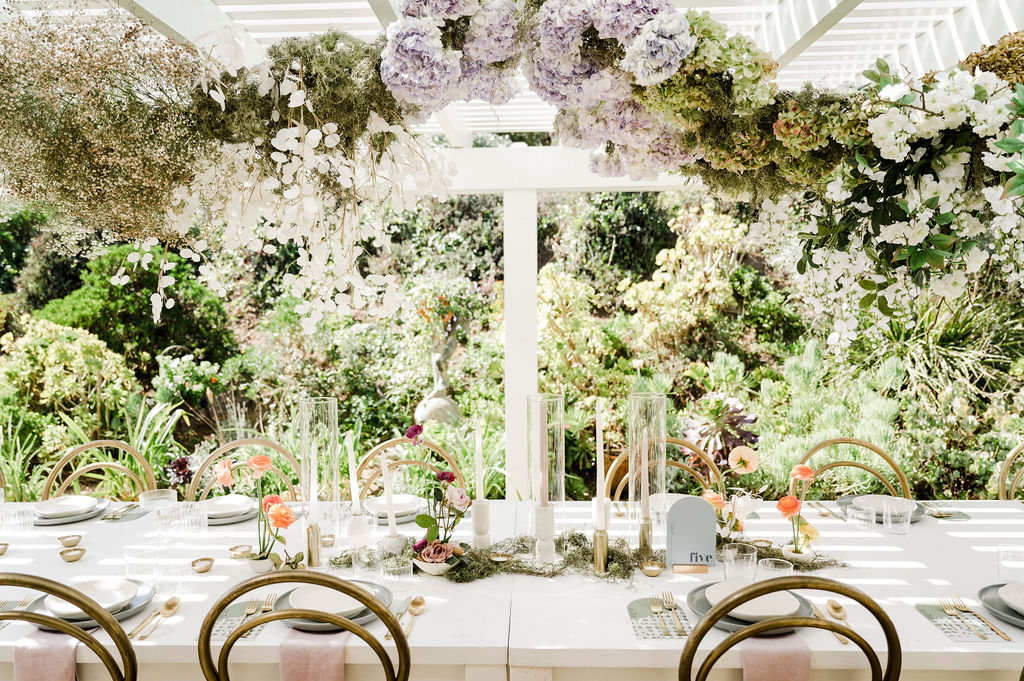
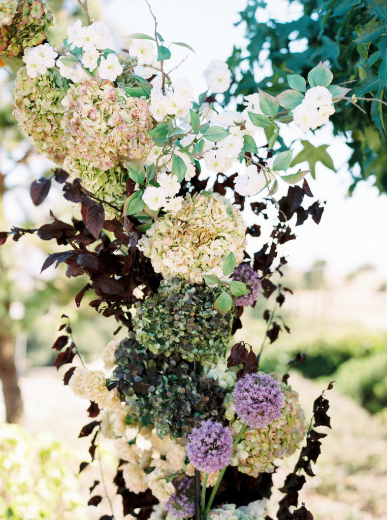
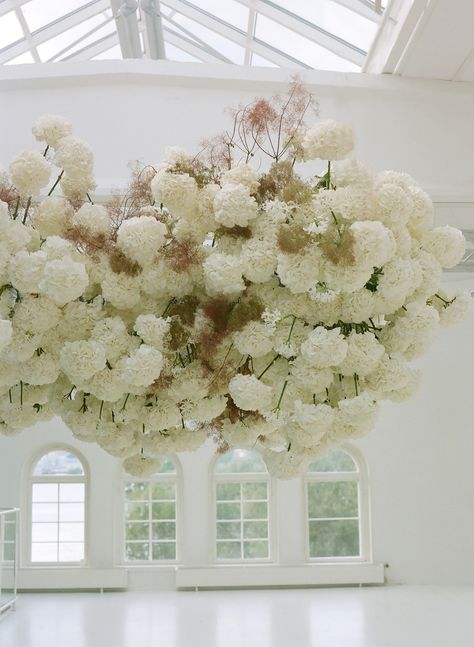
We originally planned to take advantage of the tall ceilings at Jessica’s initial venue. We hoped to create large scale, avant-garde installations utilizing the deep, dark tones in her color palette. Because we no longer had a 15+ ft ceiling to work with, we opted for a light and airy installation instead.
Bloom Babes used a mix of hydrangeas, roses, baby’s breath, lunarias, and delicate white blooms to give the installation a soft, feminine look.
Jessica’s design evolved a lot over the course of her planning process. The end result turned out to be the perfect mixture of modern elements, pops of color, feminine accents, and an abundance of different textures. Jessica’s clear vision, adaptability, and incredible vendor team made for the most epic backyard wedding!
Vendor Credits:
photo: @elliekoleen
planning + design: @crowned.events
florals: @bloombabes
tabletop rentals: @catalogatelier
furniture rentals: @adorefolklore
signage + stationary: @fawnlettering
napkins: @hostesshaven

comments +